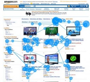
 There are many ways to convey photos and images online, yet what is the most effective method in order to maximize your web efforts? In order to best maximize photo strategy online it’s important to understand the impact of photos on web pages.
Whether it is to increase web page conversion, help with customer retention, or simply convey information most effectively – the number one mistake most webmasters make it not having a proper “enlarge photo” option.
According to usability expert Jakob Nielsen, there are dramatic differences in the impact of different types of images on web pages, and how people interact with them. Users pay close attention to photos and images that convey relevant information, but ignore photos intended to “jazz up” web pages.
In a usability study from 2010, Nielsen notes that:
–Photos of people are extremely relevant to informational websites such as personal sites or corporate “about us” pages. Users spend 10% more time looking at the photos then reading the text.
–Product photos are most effective when provided with product details. Users are likely to spend more time reading the text accompanying a photo to help make purchase decisions
–Enlarged photos and a good “click to enlarge” option is by far the most important when it comes to online photo strategy. Not including a large enough photo option is one of the biggest mistakes webmasters make.
While users dislike big photos that get in their way, they do like looking at them when requested in-order to evaluate a product. Nielsen says that “when users click the link to a bigger photo, they’re rewarded with one that’s maybe 20% larger. It should be at least twice as big, preferably more.”
Proudly, FullScreenPhotos.com falls into the “preferably more” category. A FullScreenPhotos.com slideshow rewards a user with a truly full screen photo when clicked. This allows avoidance of the biggest mistake most webmasters make online, and enables the best impact possible for online photos.


 Follow